I work as a data reporter at The Marshall Project. Before that, I’ve worked as a data reporter with The Arizona Republic and APM Reports, a news applications developer at National Public Radio and participated in fellowships with City Bureau, the Chicago Reporter and the Reed College of Media at West Virginia University. I was previously a Senior News Applications Developer at the Chicago Tribune. Prior to joining the Tribune, I was the lead developer for OpenElections and Floodlight. I also frequently collaborated with the Work Department. Here are some past and ongoing projects that I have worked on.
Monitor Chicago’s police reforms
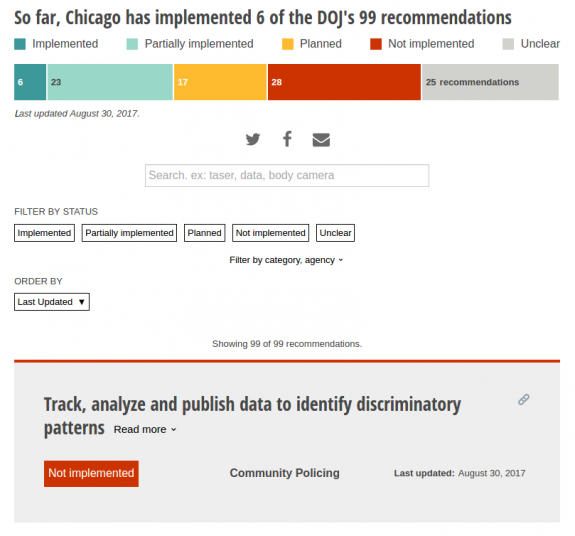
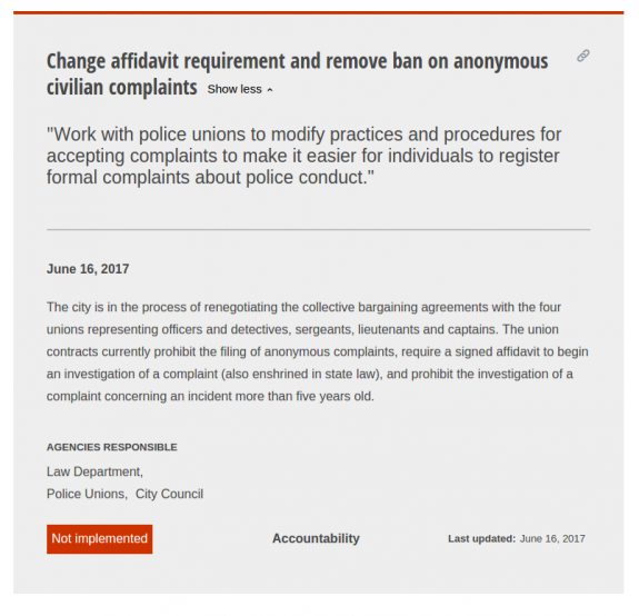
Making a tracker for reforms for the Chicago Police Department was something that I wanted to do when the Police Accountability Task Force released their recommendations in the spring of 2016, but didn’t have the bandwidth given my other responsibilities at the Tribune. So, I was excited when the Chicago Reporter asked me to build a tracker based on the U.S. Department of Justice’s recommendations for the department. Moreover, reporter Jonah Newman had done the difficult work of turning the report’s recommendations into structured data and tracking steps that the department had taken toward implementing those reforms. I worked with Jonah and data editor Matt Kiefer to figure out how to make the main story – that the department had fully implemented only a few recommendations – clear to the audience while also giving them the ability to explore other dimensions of the recommendations.
I spent a lot of time discussing, prototyping and revising the information hierarchy and design of the recommendation cards, carefully considering information hiding and which behaviors would make sense when revealing additional information. While I originally wrote the application using only Redux to manage state to minimize the number of libraries and new things a developer would have to learn to maintain the project, I eventually decided to use React as the user interface requirements became more complex.
Public Lands Map
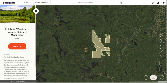
This project used my data visualization skills for a project outside of journalism, but one still centered on storytelling. The map shows national monuments whose designation is under review by the Trump administration. Working as a freelance developer on an established team, this was one of the first times I used AngularJs and the Google Maps API for a project. Luckily, my experience with other JavaScript frameworks compelled me to ask tough questions about the architecture of another app where I had been focused on back end code. To execute this project on a very short timeline, I lead the refactoring of code for an internal project into reusable AngularJS components which were then employed to make this map.
My experience making maps in the newsroom made the data preparation tasks straightforward, and I was able to quickly write a NodeJs script that merged multiple shapefiles with a spreadsheet of monument attributes. The trickiest part of this project was coordinating data preparation with the client, who was writing the text and doing the research for each monument.
Appalachian Town Hall Meetings
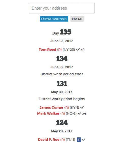
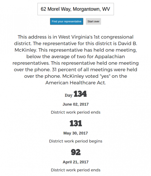
While I love, and prefer, collaboration and working on complex projects, there have been many projects where I’ve had to conceive and execute many parts of a project myself. As part of a
media innovation fellowship at West Virginia University, I compiled a database of town hall meetings
held by Appalachian members of congress. I did the initial reporting, reaching out to the offices of
each representative, and built a web application to facilitate calling dozens of representatives and
recording their responses. I also built software to collect information about meetings from press
releases and tweets. Finally, I built a simple news application to show a timeline of meetings which
could be filtered to a particular representative.
6 Ways the Republicans’ Proposed Health Care Bill Could Impact Cook County
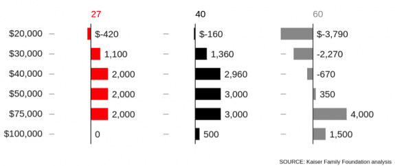
I did the reporting, analysis and made the charts for this story. I was drawn to this topic because health insurance and healthcare are part of an extremely complicated system that has a profound impact on many people’s lives. When I pitched the story, it was before any legislation text had been released. It was extremely difficult to try to find data that could suggest outcomes in a very uncertain future. When the legislation was released, and eventually scored by the Congressional Budget Office, it was a scramble to understand the implications of the legislation, reach out to sources for reactions, create charts and rewrite paragraphs of the story.
Public Notebooks
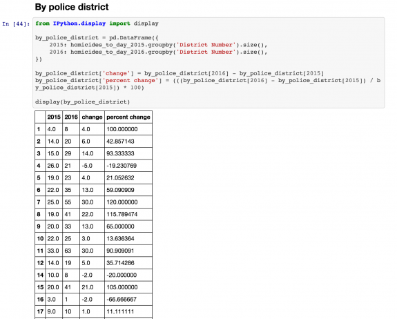
Abe Epton and I wanted to do more of our data analysis work in public. We decided the best way to do this would be to post Jupyter notebooks to a public GitHub repository since GitHub can render notebooks in its web repository viewer.
Much of the analysis work that our team does is related to an internal database of shooting and homicide victims. Breaking news editors will often want to compare the number of victims year-to-year. This notebook uses pandas to make a comparison of 2015 to 2016 homicide victim counts.
Adopting this tool was useful beyond our team. We introduced notebooks to an investigative reporter who used the notebooks to share analysis in R with sources and exports for evaluation.
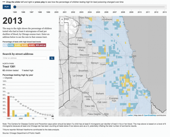
Lead testing misses likely problem areas
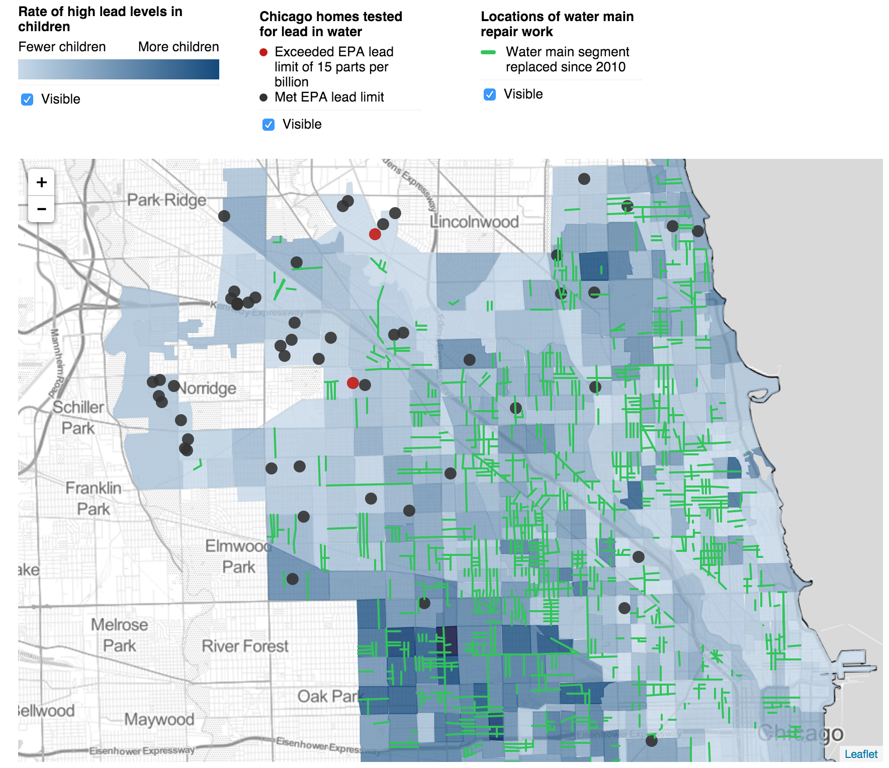
Data obtained and analyzed by Jennifer Smith Richards and Michael Hawthorn found that the locations where the city tests for lead in drinking water don’t seem to be follow either cases of child lead poisoning or streets where water main work has been done, which can cause lead to leach into tap water. This map is a choropleth showing the number of lead poisoning cases by community area, overlaid with the locations of test sites and their findings as well as locations of water main work.
After Smith Richards did some exploratory mapping with QGIS, I implemented some Python code using a Jupyter notebook and Pandas to do the data bulletproofing and normalization. This notebook generated JSON data to drive a JavaScript application that renders a Leaflet map and uses D3 for the choropleth scales. Abe Epton and some others finished publication of the project while I was on vacation by geocoding the water main data and adding it to the map as well as implementing some polish on the UI of the map legend.
Chicago school choice in charts
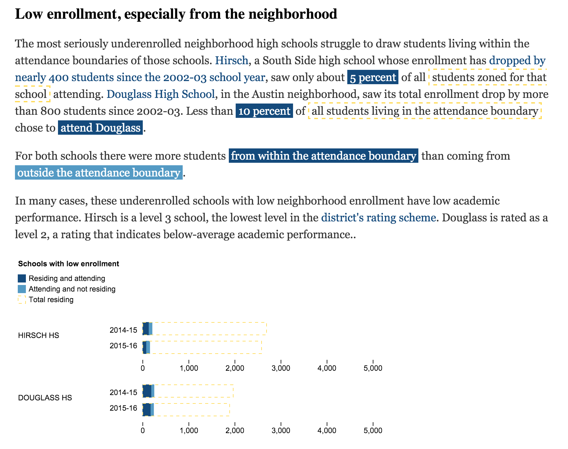
Every school-age child in Chicago lives within a designated school attendance boundary. Their families, however, don’t have to send their child to that school. These d3-generated charts show the number of students from inside and outside a school’s attendance boundary who go to a school and the number of students assigned to the boundary.
These charts accompany this story, Chicago’s neighborhood schools hurting as choice abounds.
This is a Tarbell project where I used Tarbell to configure multiple sets of the same chart form. I like how I used highlight spans in the body copy to help explain the charts in an organic way.
2015 Illinois PARCC scores
Illinois students took the new PARCC (Partnership for Assessment of Readiness for College and Careers) exam for the first time in the 2014-15 school year as the state phased out its previous standardized testing system.
In the past, the Tribune has published a school report card app app, but delays in data from the state, quirks in the data and a completely new test led us to do something faster – a client-side search rendered using React. To prepare the data, both for this app as well as for print tables in the paper and for reporter analysis, I wrote a Python package to load the raw data from the state into a PostgreSQL database.
A big part of the story is that some schools had large numbers of students who opted out of the test, so we tried to make that information prominent in the app.
Speed Cameras
The Chicago Tribune analyzed more than 2 million citations issued since Chicago’s automated speed camera program was launched in October 2013. The Tribune found that tens of thousands of drivers were ticketed under questionable circumstances. Tickets were issued when cameras were supposed to be off and when evidence was insufficient.
This project was a fairly complex news application built around a database of cameras and tickets issued by the cameras. I implemented a Python package to extract data from the analysis, originally built for the story’s analysis, and bake the data needed to drive the visualization and static site. The app was built using a combination of Tarbell and React. React is also used to render Leaflet maps of the speed camera zones.
Though the original concept was diluted, we included a lot of logic in the Tarbell project views and templates to alter the order of different components on the camera profile pages to try to highlight different potential problems with the cameras.
We also implemented a ticket search using conventionally-named JSON files, stored on S3. This allowed users to search millions of tickets without having to run a dynamic application server.
CPS school utilization
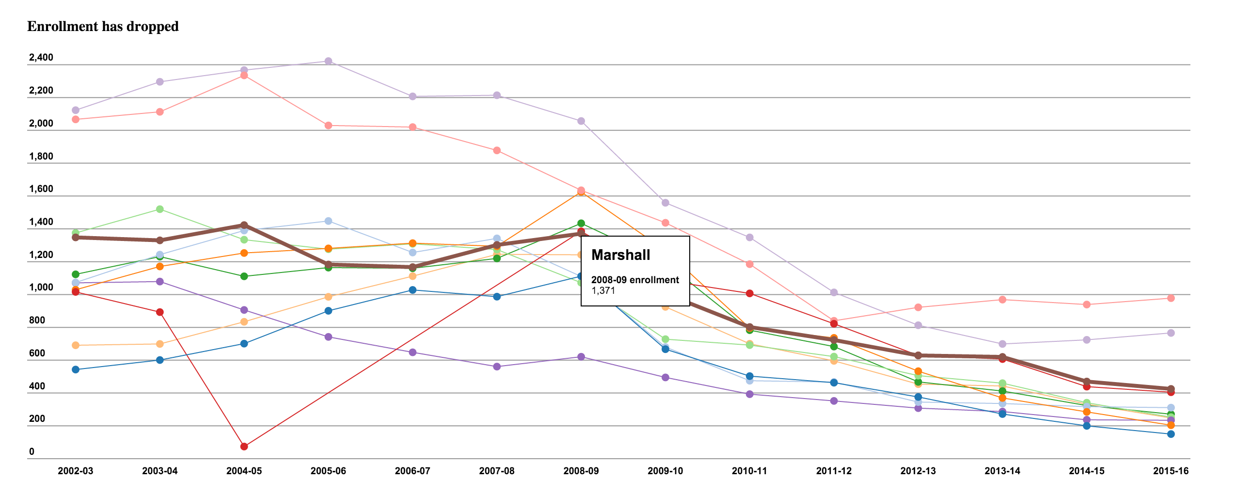
Many of the high schools run by Chicago Public Schools have experienced steep declines in enrollment, particularly in the last decade. Some of the high schools — once overflowing with more than 1,000 students — now take up just a fraction of their large buildings.
This project shows both the trends over time and uses small multiples to give a visceral sense of how underenrolled the featured high schools are.
CPS enrollment: Drops, rises and consequences
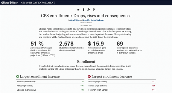
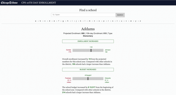
The 2015-2016 school year is the first time that Chicago Public Schools budgets will be impacted by changes in enrollment based on the district’s student-based budgeting formula. In conjunction with a story that gives an overview of the impact of enrollment changes, I updated an earlier app to let readers see the enrollment changes and budget impact of every district-operated school. This version of the app added bold summary statistics and simple charts that show where each school falls in terms of enrollment and budget changes.
From carnivals to corn mazes: Guide to Chicago-area pumpkin patches
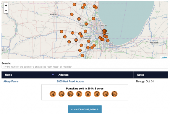
I wasn’t terribly excited about making this directory of Chicago-area pumpkin patches, but the locator map and information table form was something that I imagined would come in handy for other pieces. I imagined it would be worthwhile to spend a little bit of time writing some code that was flexible enough that we could quickly build a similar page the next time we have a table that includes point data. The result was a jQuery plugin that reads data from an HTML table and acts as glue between a Leaflet map and a table with additional interactivity added by the DataTables plugin.
Bears predictions
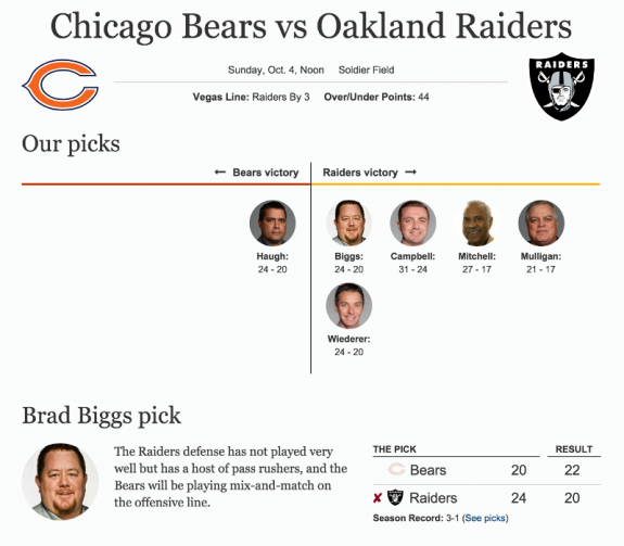
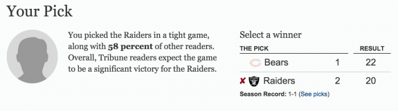
This site provides a clean, visual presentation of the Tribune sports writers’ predictions for the 2015 Chicago Bears season. It also allows readers to make their own picks and compare the results with the writers and other readers.
This is another Tarbell-powered site that uses custom Jinja filters to shape the pick and season data and minimize logic in the templates. While the site is baked to static HTML, on the backend we consume a feed from Sports Direct using a Python wrapper that I wrote for their API. The user pick feature is implemented by reusing the Listbuilder service that I originally built for the Dining Guide. This demonstrates how breaking functionality into simple micro-services lets us add dynamic functionality to a new story, even when it’s about a completely different topic. The user pick form is implemented using the React framework which encouraged a clean, modular design that was easier to debug.
Pension and bond debts drain school resources
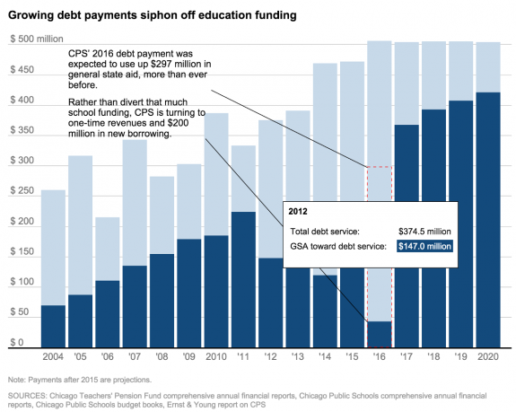
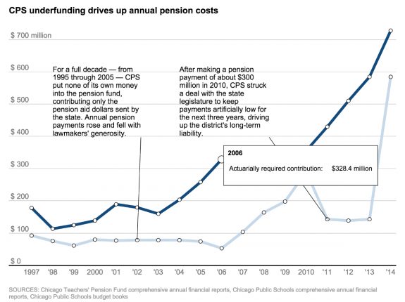
Chicago Public Schools (CPS) face a massive budget crisis due to mounting pension costs and to long-term borrowing practices. I made these responsive D3 charts to accompany a reporter’s story about the history of CPS borrowing and under-funding of its pension fund. Every aspect of the chart, from the values to the annotation placement, is generated using the Tarbell static-site generator. This allowed the reporter and me to easily collaborate as we adjusted chart values and edited chart text. While Tarbell is designed to publish to Amazon’s S3 service, I used the API of the Tribune’s content management system to publish directly to chicagotribune.com. The print version of these graphics was generated from the JavaScript-generated SVG using the SVG Crowbar tool, marking one of the first times the Tribune Graphics team used a web-first workflow for charts.
Officer-involved shootings
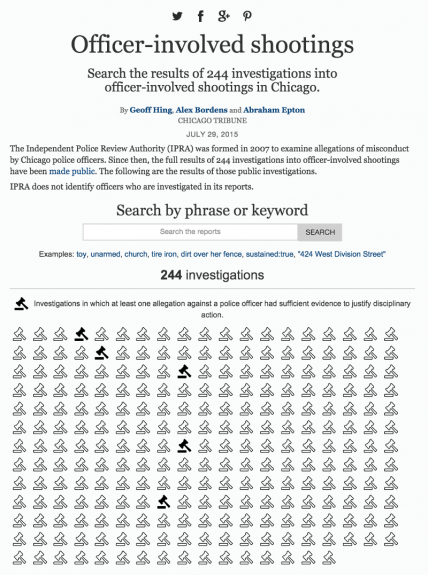
Chicago’s Independent Police Review Authority publishes reports of investigations into police-involved shootings as PDF documents. I wrote a parser to extract some structured metadata such as incident date and address from the PDFs in order to build a database of investigations. We then pushed the PDFs into DocumentCloud and used a Backbone collection wrapped around the awesome DocumentCloud API to make the documents searchable by users. While there wasn’t any significant new reporting on these shootings, we were able to make them much more accessible to the public than the presentation on the agency’s website.
CPS school budgets: Increases and cuts
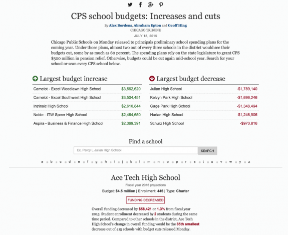
Preliminary Chicago Public Schools budget figures showed that almost two out of every three schools in the district would see their budgets cut. We build this news app in a few days to highlight the schools with the largest budget increases and decreases and also allow users to search for and see the budget changes for a particular school.
Where does the U.S. rank?
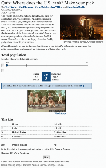
This quick-turn news quiz was an attempt to do something fun, but also informative for the Fourth of July holiday. Colleagues compiled a number of international rankings in a Google Spreadsheet and I wrote some D3 and Backbone code to provide feedback as users guessed where the United States landed in a number of rankings.
This project required a lot of thinking about how to make the interactions simple, rewarding but still informative. I did a lot of sketching to design data presentation and worked with colleagues to refined the presentation for both mobile and desktop displays. Finally, we decided to also include animated GIFs to make the quiz more fun and graphic. Using Tarbell was a good choice for this project because it let my team distribute the sourcing of GIFs and rankings.
Under the Gun 2015
For the past few years, Chicago Tribune photo editors have curated Under the Gun, a site that features striking photographs of the wake of gun violence in Chicago. The 2014 version featured powerful content, but the organization of the site seemed based around types of content rather than themes or narratives. In attempt to provide more context for these images, I designed a lightweight content management system that organized photos and videos by topics, such as neighborhoods or crime scenes and stories, such as the shooting of a child in West Humboldt Park.
To make it easier for photo editors to curate the site, my code pulls content and metadata from the Tribune’s CMS. Editors only have to tell the system about the content through a simple form in the Django admin site. In cases where the company’s CMS didn’t support metadata we needed, I devised a way to store structured data using YAML front matter in a free-text field in the CMS.
This project also made me think about issues of accountability for graphic journalism. Is it ethical to put content of families and communities at their most vulnerable moments behind a paywall? Are the people shown in these photos and videos the same ones who will be viewing the images on the website? How can we add context to graphic images that helps us be more responsible to both the subjects of the reporting and the audience?
Eat This
Admittedly, the online version of a print dining guide wasn’t a project I was particularly excited about, but it proved to be an opportunity to experiment with new technologies. This was my first project using the React framework which I found fun and easy to work with and made me think about design paradigms and data flow, even when using other frameworks.
At the Tribune, we tend to favor S3-hosted static sites generated using a tool like Tarbell or Django Bakery. However, the editors for this project wanted an interactive feature where users could make lists of dishes that they wanted to try or had eaten. Rather than incurring the overhead of a fully dynamic site, I created a simple web service with a REST API to handle the user lists. The API is abstract enough that the lists are not limited to dishes and the service can be reused for future projects that might require user-generated lists.
Poverty’s Poison
I helped build this visualization to accompany a story about Chicago children being exposed to dangerous levels of lead. I architected the front-end code, using an event bus to make a number of Backbone, D3 and Leaflet components interact with each other. Designing a way for these components to be loosely coupled made it much easier to split the implementation between myself and two other news developers and allowed us to overcome some project management challenges we faced when collaborating on other projects.
Chicago Tribune Election Center
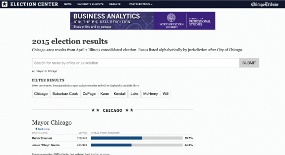
The Chicago Tribune’s Election Center is a longstanding news application that has gone through many different iterations and passed through the hands of a number of developers. David Eads gives a good breakdown of the architecture and intentions of the version of the site that I worked on in this video.
I refactored some hastily written JavaScript code into a more modular structure and used Browserify to bundle the modules. I also implemented a data pipeline that used a consistent API to load data into a results database allowing us to render results from a variety of sources including the Associated Press, Chicago Board of Elections and results hand-entered into a Google Spreadsheet by reporters.
Tribune analysis: Cops who pile up complaints routinely escape discipline
Role: Developer, Analysis
A reporter at the Chicago Tribune received years of data reflecting complaints of misconduct by Chicago Police Officers in a PDF. I wrote Python code to extract structured data from the PDF and used a PostgreSQL database to analyze the data to examine how frequently officers are disciplined based on these complaints. I worked closely with the reporter to use clear language to describe our findings while accurately reflecting the complicated disciplinary process and its representation in the data.
Convicted in Cook
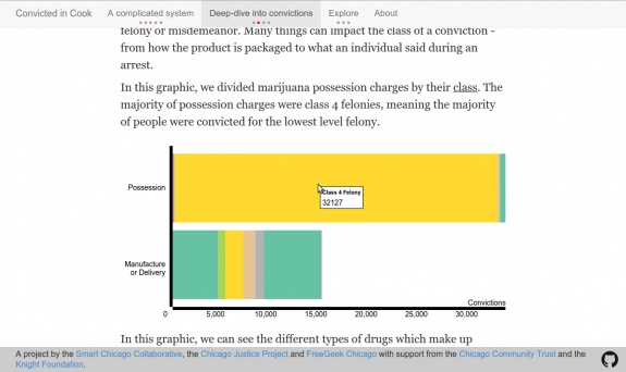
Project | Repos: ETL pipeline, website and visualization
Role: Developer
This project started as an interesting collaboration between the Chicago Justice Project, the Smart Chicago Collaborative and the Supreme Chi-town Coding Crew around a data set of criminal convictions in Cook County’s courts.
Though we received the data in CSV format, the data work ended up being a pretty heavy lift. I implemented a data cleaning pipeline using Django (mostly for its excellent spatial support) and a couple of open-source Python packages to help our project, and hopefully others look up and crosswalk between Illinois law references and crime categories.
The web component of the project uses Tarbell, which turned out to be an excellent choice as it allowed a journalist on the project team to easily edit the content and have access to the numbers behind the story. I implemented visualizations of the data using D3 and Leaflet and learned a great deal about patterns for responsive and reusable charts in the process.
Open Elections
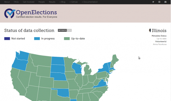
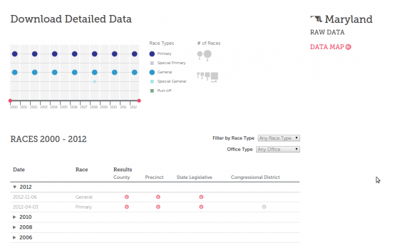
Project | Repos: website, ETL framework
Role: Developer
Before working on this Knight News Challenge-supported project, I wasn’t very familiar with elections data. What I saw invoked some real data horror: handwritten results in image PDFs, Excel spreadsheets with different structures for each county in a given election, incorrect vote counts or dates in results and nice CSVs buried under a clunky search interface. Open Election aims to untangle this mess and provide, clean, easily accessible results for all federal and state-level elections since 2000.
I enhanced and refactored the project’s ETL framework which is written in Python and uses MongoDB as the data store since the distributed approach demanded a flexible schema as we uncovered new data quirks which each state. I implemented parsers to convert results in text PDFs to structured data in CSV format. I also supported the work of volunteer developers and contributed to the project’s developer documentation. I implemented the project’s front-end website using Jekyll and SASS and a filterable interface to the results files using Bootstrap and D3. As an experiment, I wrote Tablesplitter, a proof-of-concept application that uses line detection and optical character recognition (OCR) technologies to extract tabular data from images.
Affirmations Health and Wellness Network
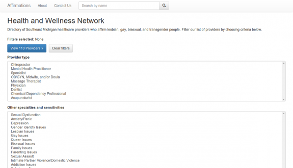
Roles: Developer
This website provides a searchable database of healthcare providers in Southeastern Michigan who serve the lesbian, gay, bisexual & transgender (LGBT) community. The site is built using Node.js and the Assemble static site generator. Backbone views and collections that leverage Lunr.js enable client-side faceted search of providers. The application uses a Google Spreadsheet as the data store and a combination of Travis CI and a small task running on Heroku to rebuild the site and deploy to GitHub pages when the spreadsheet is changed. This allows for a modern development and deployment workflow while minimizing hosting costs for the sponsoring organization.
On Board

Roles: Developer
On Board is a web application intended to help increase Millenial participation in local government by serving on public board and commission seats. The site uses the Drupal content management framework and I implemented a custom theme based on Bootstrap. Unlike other projects where I’ve used more of the base Bootstrap styles, I heavily modified Bootstrap’s LESS variables to match the designer’s specifications. I also implemented some custom Drupal feature modules to make administrator entry of relational data easier.
Cold Inside
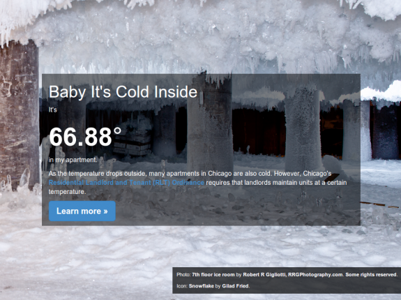
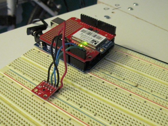
Roles: Developer, Designer
This is a recent side project where I used an Arduino and temperature sensor to take a tongue-in-cheek look at the cold weather and landlord responsibilities under Chicago’s Residential Landlord Tenant Ordinance. It reflects my interest in storytelling based on non-administrative data and curiosity about the opportunities and challenges related to data streams or sparse data.
The front end is a straightforward Bootstrap project, but it was an opportunity to use a modern toolchain that includes tools like Bower and Grunt. While they take an initial investment to learn and set up, they greatly facilitate maintaining and changing the project.
Floodlight
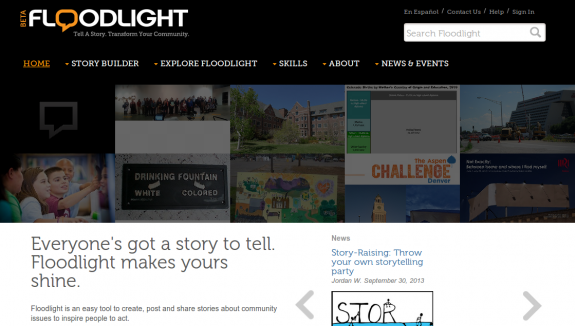
Roles: Developer
I designed the architecture and did the majority of front and back end coding of this community storytelling site. Features I built include a Backbone-based interactive story builder and a REST API built using the Django framework. The original project requirements didn’t include support for mobile devices, but we came to realize that there was a significant amount of mobile traffic and use cases that required access on non-desktop devices. Luckily, we had built a modular template system using Django’s template framework and the LESS CSS preprocessor. This made it relatively painless for me to implement responsive behaviors.
This project taught me to trust my instincts when thinking about project requirements and to encourage other stakeholders to think about factors that could lead to technical debt down the road. It would have been a big endeavor to switch the site’s templates over to a responsive framework such as Bootstrap. Instead, I incorporated some of the best practices from Bootstrap and other responsive grid implementations into the existing framework. This demonstrates my ability to not only use technologies but to understand and leverage their designs.
Illinois in the ICE Age
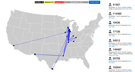
Roles: Developer, Designer
This project was built over the course of a single weekend at the MigraHack Chicago event and won a couple of prizes. Exploring datasets about migrant detention, we realized that the visualization needed to convey two narratives: the size and scope of the entire detention system and the unique trajectories of individuals within that system. I was the only developer on the team, but other team members had basic spreadsheet skills. While I implemented a database that could render the network of transfers between facilities, and the D3 visualization, my teammates explored the data to find detainees whose stories either aligned with the broad trends, or were interesting outliers.
Working on this project, I realized the importance of identifying narratives at the start of a project, when first interrogating the data. Having access to people with domain knowledge was essential to more quickly understand what to expect from the data and where to find records that were interesting or raised questions.
Signs of discontent: Personal stories underlie slogans
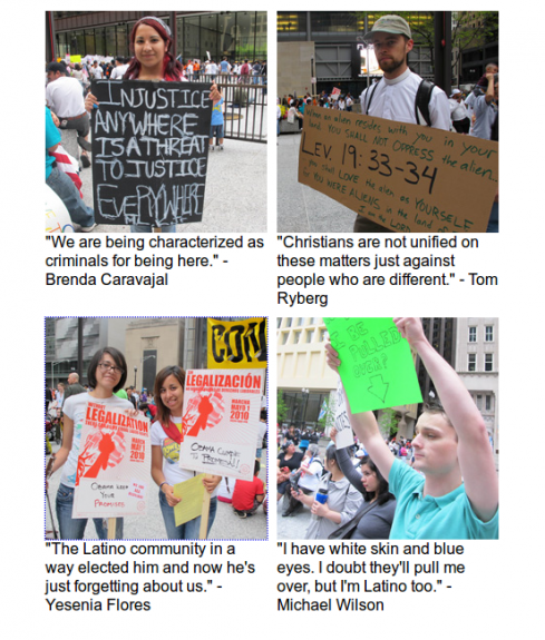
Roles: Developer, Designer, Reporter
I did the reporting for this story while I was in graduate school at Medill. I produced this interactive on deadline using a few jQuery plugins. It’s an example of figuring out a way to put more interesting content into a terrible CMS. It also presents content in a couple of “sizes” for the viewer. The images and quotations give an immediate impression of the protestors, and users have the option of hearing the voices behind the signs if they want to dive deeper.
48217 Maps

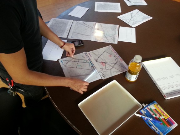
Roles: Developer, Facilitator
This is a map of 48217, a zip code and neighborhood in Detroit. The map is documentation from an activity at a DiscoTech event. The activity taught participants how a web mapping stack works and helped record neighborhood stories and history. Participants drew map features with dry erase markers on different layers of transparency film on top of a photocopy of the neighborhood streets. This allowed them to overlay different feature sets, for example, schools and liquor stores, to get different views of the neighborhood. The residents were then interviewed about the maps they drew to record spatial stories of the neighborhood’s history and their impressions of assets and toxins in the area.
The map is generated with Leaflet and a custom jQuery plugin that easily loads data in the way it was collected from activity participants. This made it easy to separate the capturing of stories and map features from the map rendering code.
Sourcerer
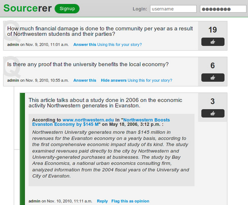
Roles: Developer, Product Development
Sourcerer was the output of the community media innovation project that I worked on during the final quarter of my MSJ program at the Medill School of Journalism. We were tasked with trying to make a technical intervention to support the hyperlocal news ecosystem in Evanston, Illinois. We developed a Django app that used a question and answer interaction to build context around topics. Unlike other Q&A sites, the technology required and facilitated that the answers be sourced from news sites.