“A/B testing” the impact of school closures using crime data

This weekend, the Knight Lab is sponsoring a hack day focusing on Chicago Crime Data as made available by the Tribune’s crime data portal and API.

I’m a little wary of crime data first because crime data does not equal a resident’s experience of safety.  It’s easy to think of situations where crimes go unreported, or where increased community cohesiveness might lead to an increase in crime reports.  Second, the way crime stats are framed and parsed by Chicago residents often seems to be alarmist and often further stresses racial and economic tensions in gentrifying communities rather than offering a space for increased community collaboration or developing progressive solutions to neighborhood safety.

Are there uses of crime data that contribute to a different civic discourse? One idea that came to me is based on this current moment where Chicago Public Schools (CPS) is slated to close a number of schools.  One issue raised by critics is the safety of students who may have to cross gang boundaries to reach their new “welcoming school”.  CPS’ proposal to provide resources for students who must attend a new school after their school has been closed, includes an expansion of the “Safe Passage” program which partners with neighborhood organizations to help increase safety for students on the way to and from school. From my knowledge as a caregiver of CPS students and as a frequent news consumer, I don’t have much sense of how successful this program has been so far.  After the closures happen, how will CPS and city residents know how school closures affected students on their way to and from school?

I hypothesize that we might be able to use crime data as one way to see changes in communities after schools have been closed.  I also think this is a general case of “how does crime change along with some policy event”.  I imagine a web platform where residents can define an “experiment” by looking at a specific geography, types of crime and time period.  Crime data would then be compared before and after the test time period to see how crime changed.

In general, I think it’s important to frame these experiments as “what changed” instead of “did this work” because I think the crime data set probably isn’t enough on its own to determine

Questions:

  • What kind of crimes would be indicators of school commute safety? Or, should we look at crimes from specific time periods before and after school?
  • What methods do sociologists use to do these kinds of comparisons?
  • Which schools/communities currently participate in the “Safe Passage” program

Other use cases:

  • Neighborhood cleanups
  • Proposed city legislation targeting liquor stores
  • “Positive loitering”
  • Negative outcomes for heightened targeting of youth by police
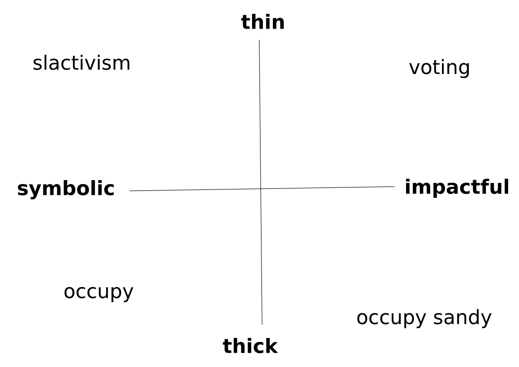
Digital engagement coordinate system

A coordinate system for framing digital civic engagement as presented by Ethan Zuckerman in his #dml2013 opening keynote

I thought Ethan Zuckerman’s opening keynote at the 2013 Digital Media and Learning conference offered a really compelling frame for digital civic engagement.  I couldn’t find the slides for this talk, so I made a quick reproduction of the visualization of the idea of the interplay between thick, thin, symbolic and impactful engagement.

Who’s accountable?

This is another “inspiration” I submitted to the 2013 Knight News Challenge. The original post is here.

Your block has been skipped in trash pickup for the last month! The air conditioning in your child’s public school building doesn’t work very well! Details about entitlement benefits are changing or confusing but you’re not sure who to ask!

There has been awesome progress for helping people identify their elected officials based on geopgrahic boundaries, or reporting issues that are a government’s responsibility, but there is still a gap in identifying the individuals or entities within a structure of governance that are responsible for specific services or information. This creates a frustrating lack of responsiveness, real or perceived, to civic concerns.

Can technology be used to visualize and query boundaries of civic accountability around services, programs, issues or problems in the same way that we can with geographic boundaries? Can this be done in a way that is open, scalable and deployable across government and civic entities?

Published
Categorized as Civics, Ideas

Overflow at civic meetings doesn’t have to mean silence

This is an “inspiration” that I posted as part of the 2013 Knight News Challenge.  The original post is here.

Public meetings are a fundamental means of civic participation in the United States.  However, in cities like Chicago, meetings can be notoriously overcrowded causing participants to have to wait in line, sit in overflow areas or be locked out. In other cases, public comment can be monopolized or sidetracked by a few outspoken participants or tensions (or real threats) can intimidate people from speaking publicly. Economic mobility, physical ability, childcare needs and differences in language can also impede participation in public comment.

Digital technologies offer an opportunity for officials, advocates and journalists to enage people in public comment in real-time, in a physical place, or to connect participants across barries of geography, ability and time.  They also offer a parallel means of public comment that can act as a sort of A/B test for existing forms of public comment. Who participates through digital parallels who doesn’t in the big room of a civic forum? What topics, questions or concerns are surfaced through digital parallels that aren’t raised at the microphone? In this way, communities deploying digital technologies for forum participation don’t aim to replace time-honored methods of civic engagement, but instead gather insight into ways to improve in-person events.

Published
Categorized as Civics, Ideas

Running jasmine tests with jasmine-jquery HTML fixtures in Google Chrome

I use Jasmine to test the Backbone code for the software behind Floodlight. My Handlebars templates for the Backbone views are in a separate file, included by the Django templates, which allows me to use the same templates when testing the Backbone views. To load the Handlebars templates for the Jasmine tests, I use the jasmine-jquery library.

This was working fine for me in Firefox, but I found that the tests were failing in Chrome.

It seems that the reason for this is that Chrome, by default, prevents JavaScript from loading local files. You can override this by starting Chrome with the --allow-file-access-from-files switch. This is the command that I run from my shell in Ubuntu:

google-chrome --allow-file-access-from-file

Here is the issue that describes this behavior and where I found the workaround. I found it through this blog post.

Fracking in Illinois

Today I read Fracking industry draws closer in Illinois.

It seems like the energy industry’s case is:

  • There’s no clean energy. Fracking can be safely regulated.
  • This will create jobs in Illinois

In evaluating these things, I wonder:

  • Has fracking been in practice long enough to evaluate long term impacts?
  • How do early estimates of negative impacts and regulation to address this of established energy extraction techniques (off-shore drilling seems like a good example) match with the realities we’ve seen since the technology was introduced?
  • How long will the jobs created by fracking in Illinois exist? How long have they existed in other communities?  Will these jobs disappear in a manner similar to auto-industry jobs in the rust belt. Do places with low unemployment exist because they have have a single large industry that employs a lot of people or a mesh of industries with pathways for people to move to other types of work when one employer dries up?
  • How do you quantify the cost of unemployment vs. being employed in a dangerous or environmentally toxic job?

Floodlight

Floodlight is a web-based platform for telling community stories from people, places and organizations around the Denver metropolitan area.  The project was originally supported by The Piton Foundation and funded in part by a grant received as part of the Knight Foundation Community Information Challenge.

Role

Lead developer

Details

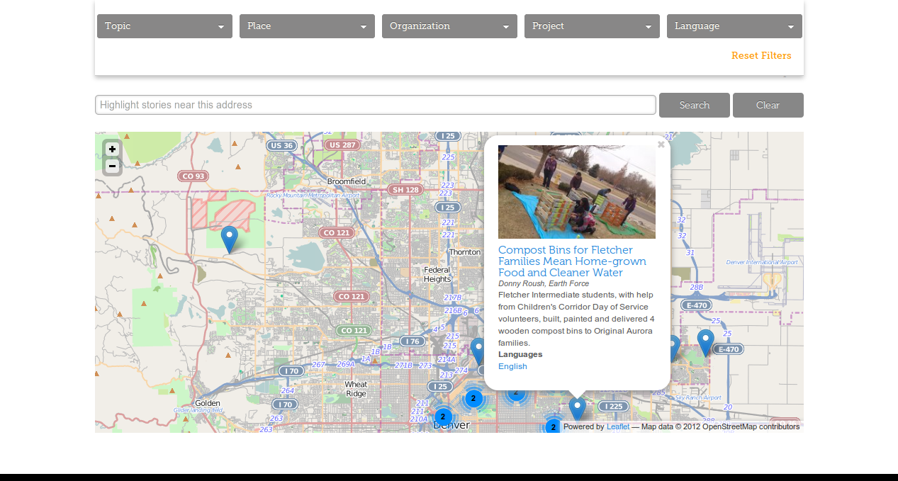
Since many of the stories told on Floodlight are about work being done in particular Denver, Colorado neighborhoods, authors needed to be able to tag their stories with boundary geographies (cities, neighborhoods, zip codes) or provide addresses of specific places, which are automatically geocoded and associated with boundary geographies.

For this project, I relied on the excellent spatial data support of the PostGIS database and abstractions offered by the Django Frameworks ORM to implement a data model and create scripts to easily load new boundary geographies from shapefiles and define their relationships with other boundaries.

Users searching for stories in their community can use a faceted browsing interface that not only filters based on address and boundary geography, but also other taxonomies.  In order to integrate these different types of filters, I used the Solr search server.  On the front end, the Backbone framework provides an interface to the faceted browse and the Leaflet mapping library is used to display boundary geographies and story markers based on the user’s filters.

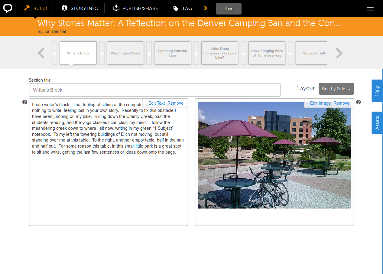
The application is powered by a RESTful API that is consumed by a Backbone-based story builder.

In addition to the web platform, the project also included a great capacity-building component.  Team members conducted “story raising” events that trained community members in different digital storytelling skills and a “story navigator” worked with community groups to discover and tell stories using the platform.

More Information

Screenshots

Home_Floodlight_-_2014-01-15_22.07.30

Explore_Floodlight_Floodlight_-_2014-01-15_22.11.14

Floodlight_Why_Stories_Matter_A_Reflection_on_the_Denver_Camping_Ban_and_the_Conversation_around_Homelessness_-_2014-01-15_22.14.54

Escaping attribute selectors in LESS

I had a really rough time finding any documentation about how to do this.  To escape attribute selectors in LESS, you have to escape the selector and wrap the escaped string in parenthesis:

(~"[data-wysihtml5-command]") {
  text-decoration: none;
}

Offline map tiles in QGIS

Participatory Mapping Station

I was invited to run a station at a DiscoTech event sponsored by the Detroit Digital Justice Coalition (DDJC). DiscoTechs are community technology fairs, and are a really great model for sharing tech knowledge within and across communities. The DDJC has released a zine with stories and bootstrap practices so other groups can run their own DiscoTech events. While previous events had been held in somewhat central locations, this DiscoTech was held at a community center in the 48217 neighborhood at the edge of Detroit and home to a strong community of environmental justice activists who are part of the DDJC.

However, the recreation center where the event was located didn’t have Internet access. This posed a bit of a problem for our station, as we wanted to have people both create analog maps of their community using paper and transparency sheets with dry-erase markers, and digital ones. I chose Quantum GIS (QGIS) as the tool to make digital maps, because it could work on my notebook without any Internet connection. I’ve used the excellent OpenLayers QGIS Plugin to provide slippy map tiles from Open Street Map as a layer in QGIS, but this wouldn’t work without an Internet connection. My solution was to essentially run a full mapping stack on my notebook computer. This was surprisingly straightforward, and helped me better understand how the pieces of a modern custom mapping stack work together.

Make your tiles

First, I had to get the raw data from which to generate my tiles. I grabbed an extract of the Detroit Metro Area from the OpenStreetMap Metro Extracts page since we were just making maps of Detroit and selecting a subset of the map data would save a lot of time when rendering the tiles.

There are lots of ways to make map tiles, but TileMill is pretty easy to use, and very powerful. MapBox, the makers of TileMill also provide a template project called OSM Bright, which they describe as “a sensible starting point for quickly making beautiful maps in TileMill based on an OpenStreetMap database.” To get a basic set of tiles for Detroit, I just followed the OSM Bright quickstart tutorial to generate the tiles I needed.

TileMill lets you export your tiles in a number of different formats, but I chose the MBTiles format because I liked the idea of all of my tiles being packaged in a single file. It just seemed more portable in case I wanted to move my project to a separate machine.

Serve your tiles

There are also many different ways to serve your custom tiles. This tutorial provides a good rundown of one method of building a server, using Mapnik to generate the tiles. However, I wanted something really lightweight, and something that would use tiles in the MBTiles format. I found TileStache, which I liked because it was written in Python, had its own built-in webserver, and supported MBTiles. Because it supports a wide variety of datasources, the configuration seemed a bit daunting at first, but was ultimately pretty simple, at least for using an MBTiles tileset.

.

This is what my tilestache.xml looked like:

<GDAL_WMS>
    <Service name="TMS">
        <ServerUrl>http://127.0.0.1:8000/${z}/${x}/${y}.png</ServerUrl>
    </Service>
    <DataWindow>
        <UpperLeftX>-20037508.34</UpperLeftX>
        <UpperLeftY>20037508.34</UpperLeftY>
        <LowerRightX>20037508.34</LowerRightX>
        <LowerRightY>-20037508.34</LowerRightY>
        <TileLevel>18</TileLevel>
        <TileCountX>1</TileCountX>
        <TileCountY>1</TileCountY>
        <YOrigin>top</YOrigin>
    </DataWindow>
    <Projection>EPSG:900913</Projection>
    <BlockSizeX>256</BlockSizeX>
    <BlockSizeY>256</BlockSizeY>
    <BandsCount>3</BandsCount>
    <Cache />
</GDAL_WMS>

And this is what my tilestache.cfg (the file that configures the datasource) looked like:

{
  "cache": {"name": "Test"},
  "layers": {
    "detroit": {
      "provider": {
        "name": "mbtiles",
        "tileset": "detroit2.mbtiles"
      }
    }      
  }
}

Add your tiles as a layer in QGIS

Update: I originally hacked the OpenLayers plugin as described below, but Nathan and David Forest pointed out in the comments that there’s a less hacky way.

GDAL > 1.7.0 supports the Tiled Map Service (TMS) format that we’re serving using to serve our tiles in Tilestache.  You can create a VRT file as described in this blog post, How to display OpenStreetMap data tiles with no plugin inside Qgis and add your tiles as a raster layer.

Hack the OpenLayers QGIS Plugin

The last step is to get the QGIS OpenLayers Plugin to use my local tileserver instead of grabbing them from the OSM tile server over the web. There’s definitely more elegant ways of doing this, but I needed to get this to work fast, so I simply edited the osm.html file that is part of the plugin. On my system, this file was located at ~/.qgis/python/plugins/openlayers/html/osm.html. I edited the file so that around line 33 of the file

, I replaced the tile URL string “http://tile.openstreetmap.org/${z}/${x}/${y}.png” with “http://127.0.0.1:8000/${z}/${x}/${y}.png”, the ServerUrl directive from my tilestache.xml.

After editing this file and starting QGIS, I was able to choose “Add OpenStreetMap layer” from the “Plugins > OpenLayers plugin” menu in QGIS to add a base layer of my custom tileset.